概述
圣杯布局和双飞翼布局解决的问题是一样的,就是两边定宽,中间自适应的三栏布局,中间栏要在放在文档流前面以优先渲染。
区别和统一
圣杯布局和双飞翼布局解决问题的方案在前一半是相同的,也就是三栏全部 float 浮动,但左右两栏加上负 margin 让其跟中间栏 div 并排,以形成三栏布局。
不同在于解决”中间栏 div 内容不被遮挡“问题的思路不一样:
圣杯布局,为了中间 div 内容不被遮挡,将中间 div 设置了左右 padding-left 和 padding-right 后,将左右两个 div 用相对布局 position: relative 并分别配合 right 和 left 属性,以便左右两栏 div 移动后不遮挡中间 div。
双飞翼布局,为了中间 div 内容不被遮挡,直接在中间 div 内部创建子 div 用于放置内容,在该子 div 里用 margin-left 和 margin-right 为左右两栏 div 留出位置。
简单说起来就是”双飞翼布局比圣杯布局多创建了一个 div,但不用相对布局了“,而不是你题目中说的”去掉 relative”就是双飞翼布局“。
圣杯布局
圣杯布局,为了中间 div 内容不被遮挡,将中间 div 设置了左右 padding-left 和 padding-right 后,将左右两个 div 用相对布局 position: relative 并分别配合 right 和 left 属性,以便左右两栏 div 移动后不遮挡中间 div。
实例
1 | <section class="container"> |
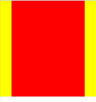
先设置container的左右padding值来摆正con_continer 的位置
1 | /*圣杯布局*/ |
如下图所示:
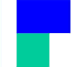
左右栏通过添加负的 margin放到正确的位置了
修改如下:
1 | .container .con_continer { |
双飞翼布局
双飞翼布局,为了中间 div 内容不被遮挡,直接在中间 div 内部创建子 div 用于放置内容,在该子 div 里用 margin-left 和 margin-right 为左右两栏 div 留出位置。
实例
1 | <section class="container"> |
1 | /*双飞翼布局*/ |
如下图所示: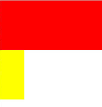
左右栏通过添加负的 margin放到正确的位置了
修改如下:
1 | .container .con_continer { |
修改后的结局为这样